Case study
They started in the year 2015 making products for people who love to travel. Their products remind them of the good times they had when they use to travel and inspire them to keep exploring.
A quick summary
They travel as much as possible and hand-make the products which they sell through their online store. They approached with the statement that they have seen firsthand the disparities that exist in this world and want to do their part to address them. We were moved by their thought process and decided instantly to help them out concerning the store revamp.
What did we do?
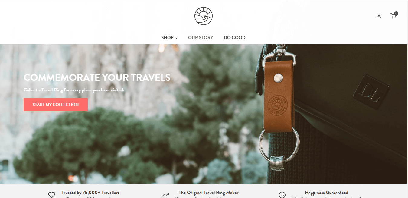
We had several rounds of requirement discussion until the project scope was frozen from the client’s end. We shared the mockup design of what we discussed during our conversations alluding to the revised look and feel of the site. The client approved the same and we replicate it into the theme codes and redesigned the site structure with a minimal and sophisticated layout.
Result
The percentage of the order placed on their site was hiked after the new site layout was published to the live audience. They create products that make them happy and believe that if everyone got to know their neighbors—whether they’re across the street or across the world—they are better off.

